Hey there, brilliant entrepreneurs and creators! Today, let’s dive on your journey to establish your website and launch your project online.
Witnessing your website and project come to life on the Internet is truly one of the most thrilling experiences.
From preparing the content and selecting images to deciding on the design, colors, and the message you want to convey, there’s so much to consider. Are you ready to embark on the journey to turn your project into a reality?
I’m here to support you every step of the way!
The first thing we need for our WordPress website is hosting.
If you are going to use WordPress.org you will need your domain and hosting. I recommend buying the domain from the same site as the hosting, it’s much easier and you won’t have to transfer or make any more technical adjustments.
What hosting do I recommend?
We currently have a lot available but I am going to recommend three. It depends on your needs which one suits you and your project best.
Once you have purchased your domain and hosting it’s time to move on to the next step. Install WordPress.
This is very easy because nowadays it is done automatically by clicking a couple of buttons. You can talk to the technical support of your hosting to have it done.
Are you going to use WordPress.com?
If you want to use WordPress.com because you like my templates, they can only be used with two of the available plans.
The Business plan and the Commerce plan. They are the only plans that you can upload themes and plugins, so to use any of my templates, you need one of those two plans.
In this post I explain the differences between wordpress.org and wordpress.com
Design, the magical ingredient setting us apart from the crowd.
Your website is your digital mansion, a mirror of your quirks and vibes, so let’s spruce it up with pizzazz! Pick colors that scream «you,» fonts that ooze charm, and images so sharp they’ll make visitors go «Wow!»
Now I’m going to give you a few tips and tricks to choose the magic ingredients that will make your website shine. Let’s get started!
Splashes of Color
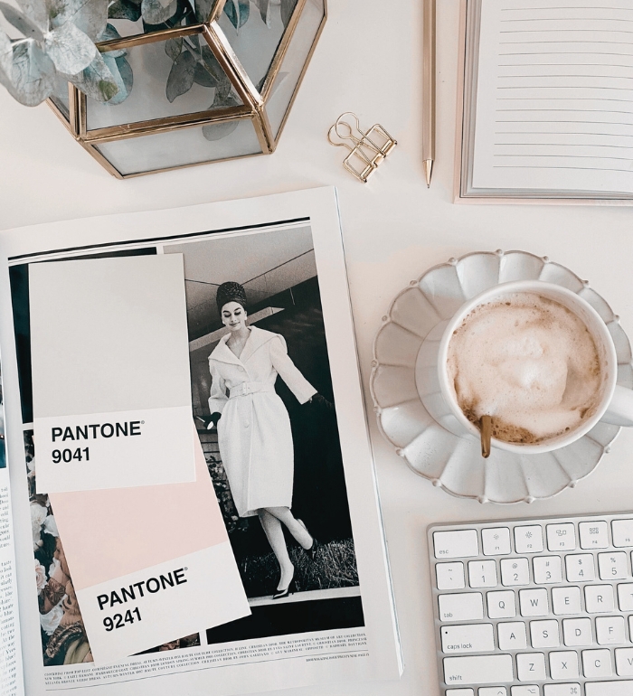
Colors can make a website look spectacular or disastrous, they play a fundamental role. Say no to eye-searing shades or wacky clashes. Opt for soothing pastels and stick to a maximum of 3 or 4 colors for that harmonious visual feast!
Here are links to my pinterest board where you will find inspiration and other websites where you can find color palettes.
Color.adobe.com >> To find and create your own palette
Coolors >> Color palette generator
If you need help with the colors of your website, you can also consult me and we will create the best palette together!
Fonts that rock!

One of the things I like the most about the design of a web page, are the fonts. Combining them well, you can make real wonders and they can completely change a design!I recommend you to choose 2 or 3 fonts at most and as with colors, do not make strange combinations.
Best combination:
- Serif font for titles
- Script/handwriting font for subtitles
- Sans Serif for texts
Here you have links for websites to find your fonts.
If you need help, I’m here!
Captivating visuals
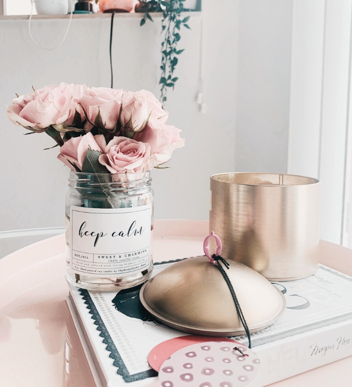
Images are the unsung heroes of web pages, demanding just as much TLC as the rest of the gang. Thankfully, in today’s world, we have a treasure trove of both free and premium image libraries that are simply splendid.
Check out these links and take your pick!
Haute Stock >> Premium awesome images + more
Styled Stock Society >> Premium Beautiful feminine images + more
Unsplash >> Infinite free images
Pexels >> Free treasures
Now that we have all the ingredients, what if we make magic with them and create a dream website.
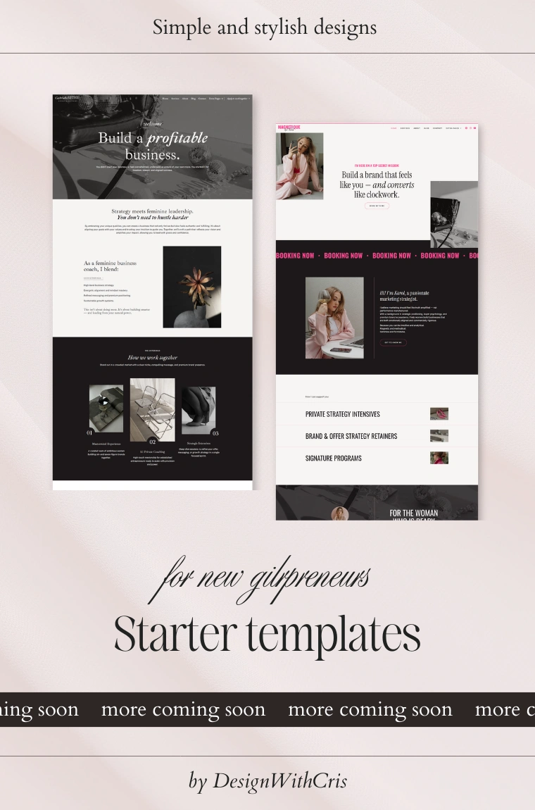
It’s time to choose your template.

