Hey there, brilliant entrepreneurs and creators! Today, let’s dive into the enchanting world of colors and uncover the magic of crafting a breathtakingly feminine website that leaves a lasting impression.
When it comes to choosing colors for a feminine website, think of soft pastels, dreamy hues, and charming accents that evoke elegance and radiate warmth. Soft pinks, soothing lavenders, calming blues, and delicate neutrals can create a palette that speaks volumes about grace and sophistication.
But here’s the secret to truly enchanting your visitors: it’s all about combining these colors in a way that complements your brand and captivates the senses. Let’s explore some delightful combinations:
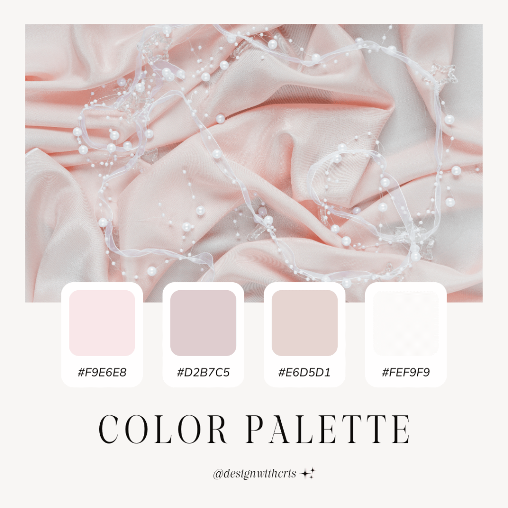
Blushing Beauty: Embrace a soft pink as your primary color, pairing it with a dusty rose and a touch of ivory. This palette exudes romance and allure, perfect for wedding planners or lifestyle bloggers.

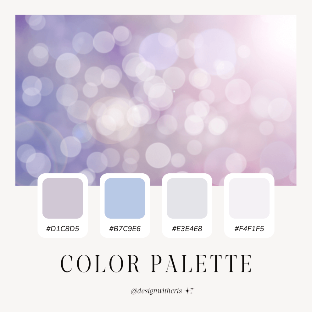
Tranquil Serenity: Blend soothing lavender with a gentle sky blue and a hint of silver. This combination creates a tranquil and ethereal ambiance, ideal for wellness or beauty websites.

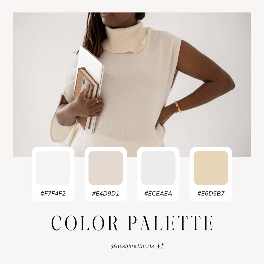
Elegant Neutrals: Combine soft beige, blush, and a hint of gold for a sophisticated and timeless palette that exudes understated glamour, ideal for fashion or luxury lifestyle brands.

Remember, it’s essential to maintain a balance. Use your primary color for key elements such as headers and call-to-action buttons, while integrating accent colors to add depth and visual interest.
Dear entrepreneurs, your brand’s online presence is a reflection of your unique journey and vision. With the power of colors, you have the ability to infuse your website with an aura of elegance and grace that truly resonates with your audience.
So, as you embark on this creative journey, take a moment to envision the captivating color palette that best represents your brand’s identity. Let your imagination soar, experiment with various combinations, and witness the transformative power of colors.
Embrace the beauty of femininity and the potent allure of color as you craft your dreamy online space. With our tailored themes and your creative vision, you have the power to conquer the online world with elegance and finesse. Shine on, dear entrepreneurs, and let your website embody the radiance of your brilliance!
Warmly,
Cristina


